

festival posters
We designed these festival posters to take advantage of the store’s large display windows. We created diptych posters that when placed side by side in the window became one continuous image.
creative use of materials
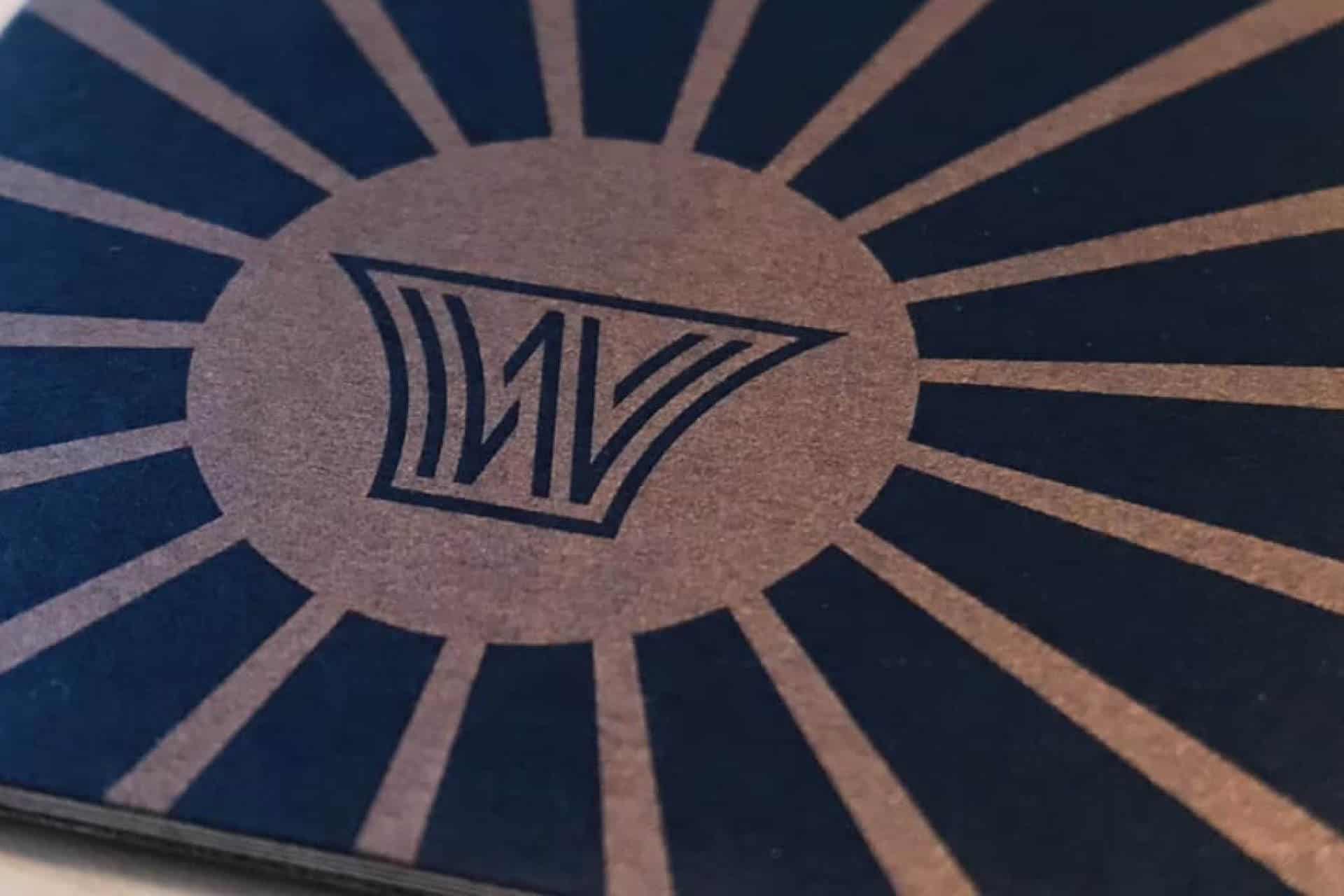
We chose a duplex stock that was black paper on one side and white on the other. It is thicker than traditional business card stock, and friendly to metallic inks. In a world of full color, this use of paper and metallic ink make their business cards memorable.
advertising
We have created a variety of advertising for WindWorks, from print and online ads to posters for public schools.
tones drawn from the instruments
The WindWorks palette draws from the warm, lustrous tones of brass instruments — rich golds and deep ambers that feel as familiar as a well-worn trumpet case. The Art Deco influences in the logo shaped the color direction as well. The palette carries the same sense of craft and intention that defined the era — bold, considered, and built to last.
